| All Types |
|
- type: the type itself (Box, Text, etc.)
- padding: empty space to leave around all edges of this element in dp
- paddingTop: empty space to leave around the top edge of this element in dp
- paddingBottom: empty space to leave around the bottom edge of this element in dp
- paddingStart: empty space to leave around the start edge of this element in dp. In Left to Right environments, this is the left side of the element.
- paddingEnd: empty space to leave around the end edge of this element in dp. In Left to Right environments, this is the right side of the element.
- width: the width of the element in dp.
- height: the height of the element in dp.
- size: the size of the element in dp. This is a shortcut for setting the width and height to the same value.
- fillMaxWidth: if true make this element fill the maximum width possible given all other constraints.
- fillMaxHeight: if true make this element fill the maximum height possible given all other constraints.
- fillMaxSize: if true make this element fill the maximum size possible given all other constraints. This is a shortcut for setting the fillMaxWidth and fillMaxHeight to the same value.
- isWeighted: if true, give this element weight. This means that this element will occupy the same space as other elements at the same level that also are weighted. Important: only works inside Row or Column.
- cornerRadius: radius in dp to make the corner of the element rounded.
- visibility: Can be one of .
- Visible: The default state where the element is displayed normally and occupies space.
- Invisible: The element is hidden from view but still occupies space in the layout.
- Gone: The element is hidden and removed from the layout, taking up no space.
- backgroundColor: the color of the element in HTML notation, or one of these Material You Colors
- useMaterialYouColors: set to true to automatically set the colors of all elements to Material You colors. This flag applies to all of this element's children and can be overridden on each lower level if needed, by defining it there.
- task: Tasker Task to run when the element is tapped. The %caller() array will be updated with the value widgetv2_WIDGET_NAME where WIDGET_NAME will be the name you gave your widget.
- taskVariables: a JSON object where each property name is a Tasker variable (without the %) name and each value is that variable's value.
- command: Tasker Command to emit when the element is tapped. This will trigger the Command event in Tasker.
- commandPrefix: prefix to prepend to the above command. For example, if this is set to prefix and command is set to my_command, then the prefix=:=command command will be emitted. This prefix applies to all of this element's children and can be overridden on each lower level if needed, by defining it there.
|
| Container (Box, Row, or Column) |
Important: Unless it's scrollable, a container can only have a maximum of 10 children. If you add more than 10 children, only the first 10 will show. This is a system limitation.
About the Box container: You can use multiple Boxes nested inside each other to create layers. For example, you can have a base Box with 4 boxes inside it, each with its own content alignment to position your elements exactly where you want them to be. Check out the Box example here to see how this works.
- verticalAlignment: the vertical alignment of this container's content. Can be one of
- horizontalAlignment: the horizontal alignment of this container's content. Can be one of
- children: an array of any number of child elements. You can include any element here like Text, Image, etc., or even other containers like Box, Row, or Column to create the layered structures you need.
- scrolling (Column only): if true, will allow the items on the list to scroll vertically.
|
Column Example
{
    "type": "Column",
    "verticalAlignment": "Center",
    "horizontalAlignment": "Start",
    "backgroundColor": "#00FF00",
    "children":[...OTHER ELEMENTS HERE...]
}
Box With Layers Example
{
"children": [
    {
    "contentScale": "Crop",
    "url": "https://coolbackgrounds.io/images/backgrounds/index/sea-edge-79ab30e2.png",
    "size": "fill",
    "type": "Image"
    },
    {
    "children": [
        {
        "color": "#FFFFFF",
        "text": "This is at the top",
        "padding": {
            "top": 16
        },
        "type": "Text"
        }
    ],
    "horizontalAlignment": "Center",
    "verticalAlignment": "Top",
    "size": "fill",
    "type": "Box"
    },
    {
    "children": [
        {
        "color": "#FFFFFF",
        "text": "This is at the bottom",
        "padding": {
            "bottom": 16
        },
        "type": "Text"
        }
    ],
    "horizontalAlignment": "Center",
    "verticalAlignment": "Bottom",
    "size": "fill",
    "type": "Box"
    },
    {
    "children": [
        {
        "color": "#FFFFFF",
        "text": "This is on the left",
        "padding": {
            "start": 16
        },
        "type": "Text"
        }
    ],
    "horizontalAlignment": "Start",
    "verticalAlignment": "Center",
    "size": "fill",
    "type": "Box"
    },
    {
    "children": [
        {
        "color": "#FFFFFF",
        "text": "This is on the right",
        "padding": {
            "end": 16
        },
        "type": "Text"
        }
    ],
    "horizontalAlignment": "End",
    "verticalAlignment": "Center",
    "size": "fill",
    "type": "Box"
    }
],
"horizontalAlignment": "Center",
"verticalAlignment": "Center",
"fillMaxSize": true,
"type": "Box",
"useMaterialYouColors": false
}
|
| Grid |
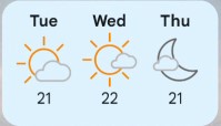
A grid has 2 modes: fixed and minSize. You can set one or the other, but not both. If you don't set either, a minSize of 32 will be set by default.
If a grid takes up more vertical space than the widget has, it'll automatically become scrollable.
- fixed: the number of items on each row
- minSize: the minimum size of each item in dp. If this is set, the max number of items with this size will be used per row.
- horizontalAlignment: the horizontal alignment of this container's content. Can be one of
- children: an array of any number of child elements. You can include any element here like Text, Image, etc., or even other containers like Box, Row, or Column to create the layered structures you need.
|
{
    "type":"Grid",
    "fixed": 3,
    "useMaterialYouColors":true,
    "fillMaxSize": true,
    "horizontalAlignment":"Center",
    "padding": 8,
    "children":[
        {
            "type":"Text",
            "text":"Tue",
            "bold":true
        },
        {
            "type":"Text",
            "text":"Wed",
            "bold":true
        },
        {
            "type":"Text",
            "text":"Thu",
            "bold":true
        },
        {
            "type":"Image",
            "url":"https://www.awxcdn.com/adc-assets/images/weathericons/3.svg",
            "size": 48
        },
        {
            "type":"Image",
            "url":"https://www.awxcdn.com/adc-assets/images/weathericons/2.svg",
            "size": 48
        },
        {
            "type":"Image",
            "url":"https://www.awxcdn.com/adc-assets/images/weathericons/34.svg",
            "size": 48
        },
        {
            "type":"Text",
            "text":"21"
        },
        {
            "type":"Text",
            "text":"22"
        },
        {
            "type":"Text",
            "text":"21"
        }
    ]
}
|
 |
| Text |
- text: the text content itself
- maxLines: maximum number of lines to display. If more lines would be displayed, an ellipsis is shown instead.
- color: the color of the text in HTML notation, or one of these Material You Colors
- textSize: the size of the text in sp (scale-independent pixels)
- bold: true to make the text bold
- italic: true to make the text italic
- underline: true to make the text have a line under it
- linethrough: true to make the text have a line through it
- align: aligns the text. Can be one of
- Left
- Right
- Center
- Start
- End
- fontFamily: sets the font of the text. Can be one of
- Serif
- SansSerif
- Monospace
- Cursive
|
{
    "type": "Text",
    "text": "Example",
    "color": "#000000",
    "textSize": "14",
    "align": "Center"
}
|
 |
| Image |
- url: URL or content URI that points to an image. Can be HTTP.
- tint: a color that will colorize the image so it'll become a single solid color.
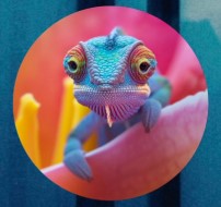
- circle: if true, the image will be cropped in the shape of a circle.
- sepia: if true, the image will be colored in a sepia tone.
- grayscale: if true, the image will have no color.
- contentScale: defines how an image is scaled. Can be one of
- Crop: Scale the image uniformly (maintaining the image's aspect ratio) so that both dimensions (width and height) of the image will be equal to or larger than the corresponding dimension of its parent container.
- Fit: Scale the image uniformly (maintaining the image's aspect ratio) so that both dimensions (width and height) of the image will be equal to or less than the corresponding dimension of the parent container.
- FillBounds: Scale horizontally and vertically non-uniformly to fill the parent container bounds.
|
{
    "type": "Image",
    "url": "https://letsenhance.io/static/8f5e523ee6b2479e26ecc91b9c25261e/1015f/MainAfter.jpg",
    "circle": true,
    "contentScale": "Fit"
}
|

|
| Spacer |
A Spacer is very useful to adjust the layout of other elements. For example, if you add a scrollable column with a bunch of Text elements, it looks less cramped if after each element you add a Spacer
If you set the isWeighted property on all your spacers inside a container you can also guarantee that each element is laid out evenly like in the example given here. Notice how the same layout works when the widget is small and when it's larger.
|
                            {
                                "type":"Row",
                                "useMaterialYouColors":true,
                                "fillMaxSize": true,
                                "horizontalAlignment":"Center",
                                "verticalAlignment":"Center",
                                "children":[
                                    {
                                        "type":"Spacer",
                                        "isWeighted":true
                                    },
                                    {
                                        "type":"Text",
                                        "text":"An"
                                    },
                                    {
                                        "type":"Spacer",
                                        "isWeighted":true
                                    },
                                    {
                                        "type":"Text",
                                        "text":"even"
                                    },
                                    {
                                        "type":"Spacer",
                                        "isWeighted":true
                                    },
                                    {
                                        "type":"Image",
                                        "url":"https://cdn-icons-png.flaticon.com/512/1933/1933108.png",
                                        "size":32
                                    },
                                    {
                                        "type":"Spacer",
                                        "isWeighted":true
                                    },
                                    {
                                        "type":"Text",
                                        "text":"layout!"
                                    },
                                    {
                                        "type":"Spacer",
                                        "isWeighted":true
                                    }
                                ]
                            }
|
|
| Button |
- text: the text displayed on the button
- enabled: whether the button is enabled
- contentColor: the color of the button's content
- buttonType: the type of button. Can be one of
- icon: URL or content URI that points to an image. Can be HTTP.
|
{
    "type": "Button",
    "text": "Click Me",
    "enabled": true,
    "buttonType": "Filled",
    "icon": "https://cdn-icons-png.flaticon.com/512/154/154871.png"
}
|
 |
| IconButton |
- enabled: whether the icon button is enabled
- contentColor: the color of the button's content
- buttonType: the type of icon button. Can be one of
- icon: URL or content URI that points to an image. Can be HTTP.
|
{
    "type": "IconButton",
    "enabled": true,
    "buttonType": "Circle",
    "icon": "https://cdn-icons-png.flaticon.com/512/154/154871.png"
}
{
    "type": "IconButton",
    "enabled": true,
    "buttonType": "Square",
    "icon": "https://cdn-icons-png.flaticon.com/512/154/154871.png"
}
|
|
| Compound Components (CheckBox or Switch) |
- text: the text displayed next to the component
- checked: whether the component is checked
Important Note: when you tap this element and its state changes, the new state will be sent to the task as %par1 if "task" is set, or as a command suffix if "command" is set.
For example, if you tap this element and it becomes checked:
- If "task" is set - The task will be called with %par1 set to "true"
- If "command" is set to "clickedit" - The "clickedit=:=true" command will be sent
|
{
    "type": "CheckBox",
    "text": "Accept Terms",
    "checked": true
}
{
    "type": "Switch",
    "text": "Kitchen Light",
    "checked": false
}
|
|
| Progress |
Progress elements have 2 modes:
- Progress Bar: is enabled if you set the progress property
- Circular Progress Indicator (undefined progress): is enabled if you don't set the progress property
If you use a Progress Bar, the backgroundColor property in will be used to color the part of the progress that hasn't been reached yet.
- color: the color of the progress bar or circle
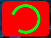
- progress: the progress value, between 0 and 100. If not set, a circular indicator that doesn't actually show a numerical progress will be shown.
|
{
    "type": "Progress",
    "color": "#00FF00",
    "backgroundColor": "#FF0000",
    "fillMaxWidth": true,
    "progress": 50
}
{
    "type": "Progress",
    "color": "#00FF00",
    "backgroundColor": "#FF0000",
    "fillMaxSize": true
}
|
|
| Scaffold |
A Scaffold is just a pre-formatted component that adds a title and some child elements with pre-defined padding values. You have to use the TitleBar element described below as the titleBar element.
To be clear, you can achieve this same layout by using the other more basic layouts with manual padding values, colors and so on, if you want. This is just a shortcut.
- horizontalPadding: the horizontal padding inside the scaffold in dp
- titleBar: an element of the type TitleBar that will serve as the title of the widget
- children: an array of child elements for the main content
|
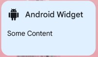
{
    "type": "Scaffold",
    "titleBar": {
        "type": "TitleBar",
        "text": "Android Widget",
        "icon": "https://cdn-icons-png.flaticon.com/512/154/154871.png"
    },
    "children": [
        {
            "type": "Text",
            "text": "Some Content"
        }
    ]
}
|
|
| TitleBar |
Important: if you don't set an icon the TitleBar will not show up.
This element is not supposed to be used standalone. It's supposed to be used as the titleBar item in the Scaffold element described above.
A TitleBar is just a pre-defined structure that lays out the icon, text and actions in a way that automatically looks "good". If you want your widget to have a title, this is probably a good way to do it.
To be clear, you can achieve this same layout by using the other more basic layouts with manual padding values, colors, sizes and so on, if you want. This is just a shortcut.
- icon: mandatory URL or content URI that points to an image. Can be HTTP. Will always be tinted with the iconColor.
- text: the text of the title
- iconColor: the color of the icon
- textColor: the color of the text
- actions: an array of IconButtons with buttonType set to Circle and no backgroundColor
|
{
    "type": "Scaffold",
    "titleBar": {
        "type": "TitleBar",
        "icon": "android.resource://net.dinglisch.android.taskerm/drawable/mw_action_android",
        "text": "An Action Bar!",
        "iconColor": "primary",
        "textColor": "onSurface",
        "actions": [
            {
                "type": "IconButton",
                "icon": "android.resource://net.dinglisch.android.taskerm/drawable/mw_action_cached",
                "buttonType": "Circle",
                "contentColor": "primary"
            },
            {
                "type": "IconButton",
                "icon": "android.resource://net.dinglisch.android.taskerm/drawable/mw_action_record_voice_over",
                "buttonType": "Circle",
                "contentColor": "primary"
            }
        ]
    }
}
|

|
